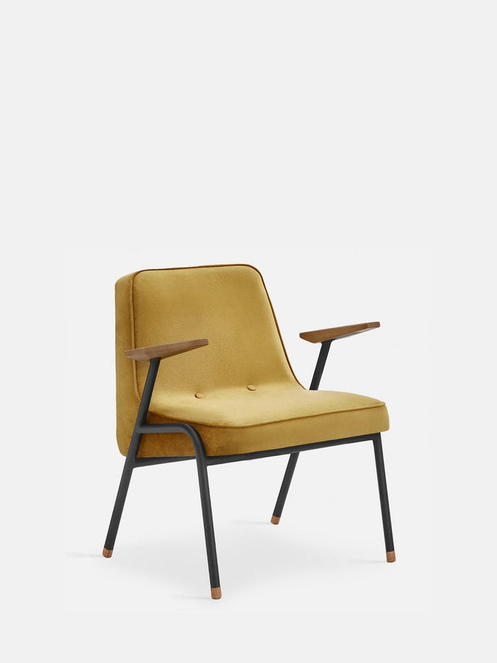
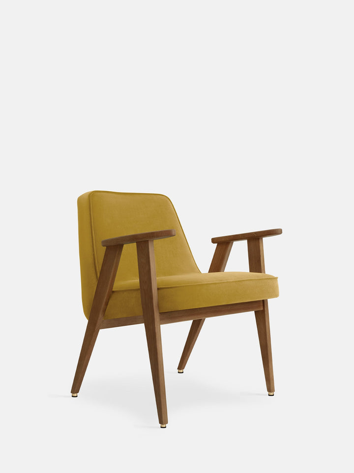
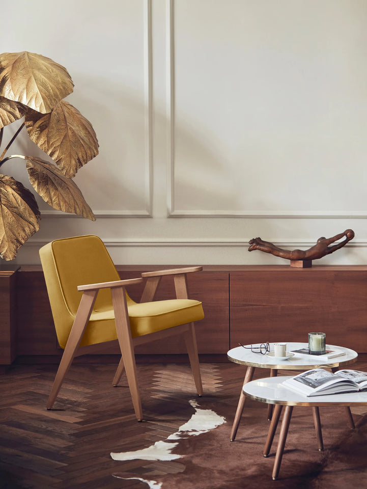
Mustard: The Flagship Color of the 60s
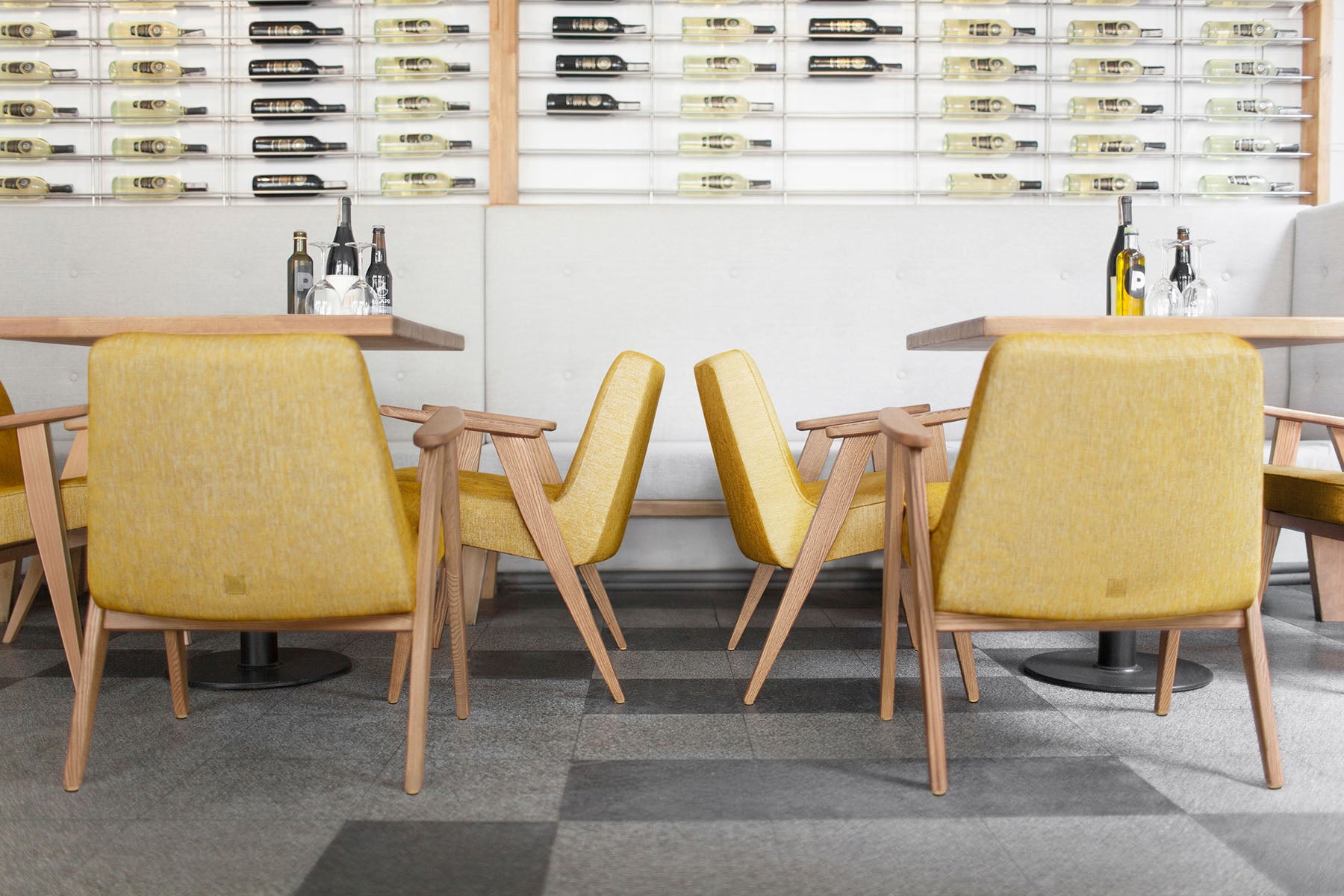
Why does it affect us in such a way and constantly delights us? Because mustard is the flagship color of everything associated with retro design. The king of the 1960s returned for good in the 21st century, bringing a feeling of warmth, joy and a note of nostalgia to our interiors.


A bit of history: where did the mustard color come from?
The days the mustard color revival began around 2017, when trendsetters saw is the new millennial pink. There were numerous articles about it and new names invented, like “golden yellow”, “fair-trade turmeric”, “generation Z yellow” or simply … mustard. We have to rember, however, that long before the Yellow Generation Z, fair-trade turmeric, and even the mustard itself, there was ocher. Before the corporations, cars, ships, and even cities or agriculture were invented, we already had ocher.
Ocher is one of the earliest pigments used by humans , made of a mixture of clay, sand and iron hydroxide. Archaeologists believe that the earliest known drawing in history was a hatch pattern with a hint of red ocher, created about 73,000 years ago in a cave in South Africa. And because ocher was cheap and available, artists also liked to use it. This subtle brown-yellow yellow color can be found in the works of famous artists such as Titian, Rembrandt, Van Gogh, Kandinsky, Monet, Seurat, El Greco, Cézanne, Degas and Vermeer.

Mustard in the 20th century
Pantone’s book ‘The 20th Century in Color’ breaks down every decade according to color trends, and when you turn the pages, you notice something interesting. Almost every decade has its own burnt, brownish golden yellow. The 1900s has a bright “yellow-yellow” by Paul Poiret, and the 1920s “rich gold.” The “yolk” is making a comeback with the Bauhaus school, and “radiant yellow” has a big moment in the 1930s, thanks to Leo Baekeland’s plastic patterns.
There is an entire spread on Edward Hopper who used mustard shades of orange to paint his melancholic landscapes and eateries, and the second spread is for mid-century modernists who used a slightly brighter (though still brown-tinted) yellow called “mimosa” for their muted designs. Perhaps the most famous yellow of the 20th century is harvest gold, which was popular in the 1970s and often paired with avocado green and rusty red. The only decade that didn’t really have a brownish-yellow tinge was in the 1990s.
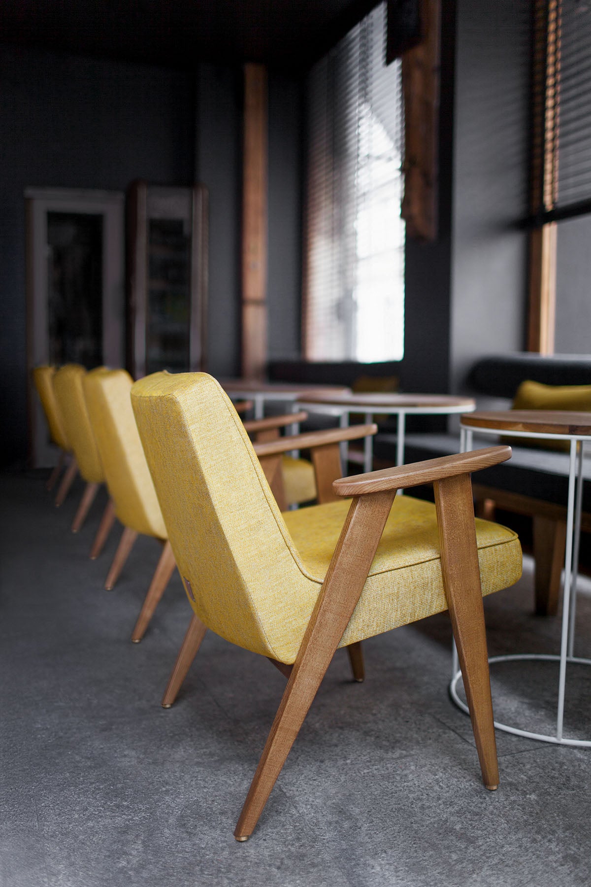
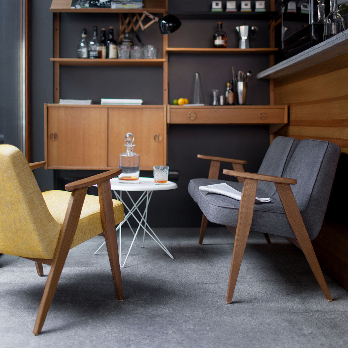
How and why does it have such a mustard effect on us?
Psychology has no doubts that color influences our mood and builds emotions. Warm colors have a stimulating effect, while cold ones calm down and relax. The mustard color is surely in the first group of colors. According to the Pantone Institute, a global specialist in color, mustard is a spicier version of the traditional yellow. The Institute describes it as an unusual and surprising color that adds energetic vibrations. Yellow is recognized by psychologists as a natural antidepressant, which adds serenity and self-confidence. It is synonymous to vitality, symbolizes spontaneity, liveliness and the sun, the energy of life.
Perhaps it works so well on the human psyche because it was with us from the very beginning of human existence. It accompanies us from the first days of fledgling civilizations, was present during the Renaissance, awakened minds in the 1930s and soothed the senses in the post-war interiors of the 1960s, to finally fight for freedom along with the hippie movement. So mustard is not just a combination of yellow, orange and brown. It is a color that accompanies man from the very beginning of his existence, adds life energy and invariably delights.
